This was another design I created in Typography.
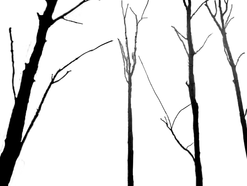
In this I used two letters or numbers to form a unique negative
space within a frame. For the first two I used a seven that I liked
the look of and in the third I found a J and an S from a serif family
that fill well together and reversed it out for a sharper look.
In this I used two letters or numbers to form a unique negative
space within a frame. For the first two I used a seven that I liked
the look of and in the third I found a J and an S from a serif family
that fill well together and reversed it out for a sharper look.

